
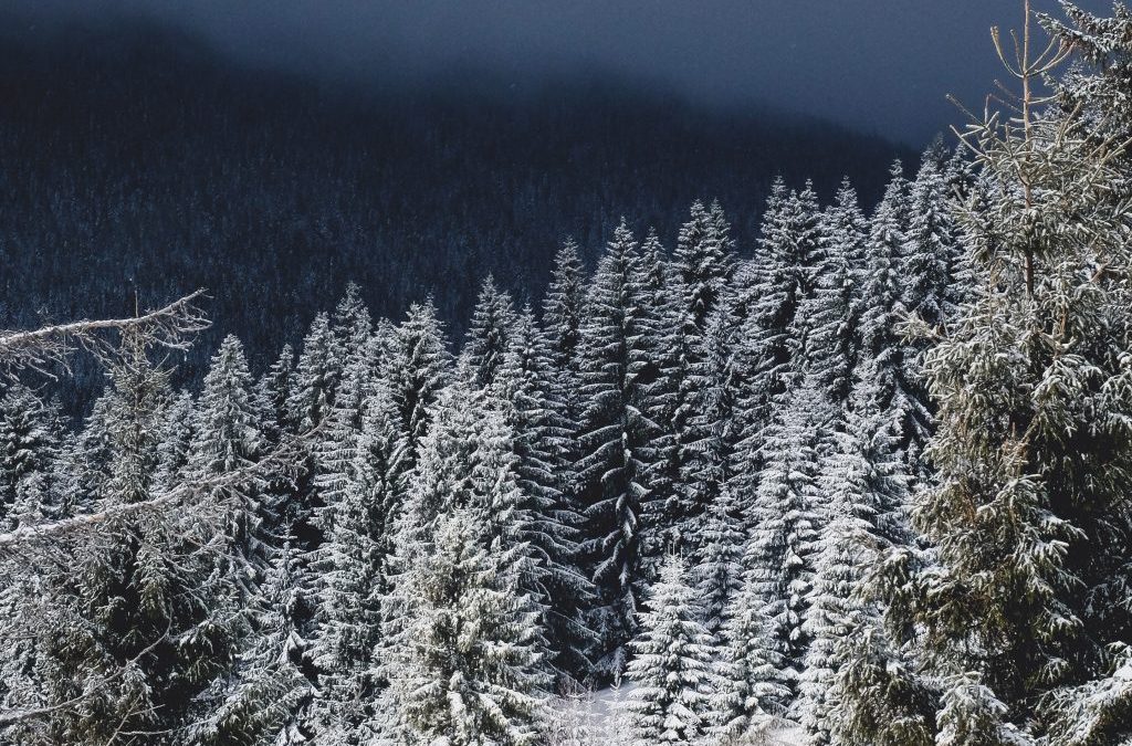
Winter weather is in full effect here in Colorado. We have days of heavy snow, followed by milder days where the skies are clear, sunny, and blue. Thinking back to teaching Pre-K, it was always interesting how the sun, or the lack of it, could have an impact on the children’s overall demeanor and activity for the day.
Light is an abstract and whimsical subject. It can be explored in infinite ways. Winter is the perfect time to invite children to experiment with lightness and darkness. No other season shows us such a stark contrast between the two. Between holiday lights around town, the early sunsets, and gloomy skies, there are plenty of opportunities to explore the juxtaposition of the two. Lightness and darkness are often explored through shadow and light play. Other ways to explore the subject bare through color, shade, tone, and tint. Paint mixing is an open-ended and engaging way to observe the varied ways color can be interpreted and represented.
Experience Lightness and Darkness Through Color Mixing
Paint mixing opens up the opportunity to talk about colors with “expert” vocabulary. Here are some terms to incorporate into paint mixing:
Hue: color. Includes Yellow, Orange, Red, Violet, Blue and Green. Never includes Black, White, or Grey.
Tint: any hue with White added to it.
Tone: any color plus Grey (or both Black and White).
Shade: any hue with Black added to it.
Some questions to ponder while mixing hues, tints, tones, and shades:
How does changing the shade or tint change the color?
What feelings or messages do colors convey?
How does this color make you feel?
How can you change the feeling of a color by adding more black or white?
How can we use them to communicate a feeling, time, place, or idea?
After the color mixing experience, facilitate a discussion about color and what it can communicate. Use this lens while you view illustrations in children’s books.
Pose questions such as:
-why do you think the illustrator or photographer chose to use these colors?
-how do the illustrations make you feel?
-if the colors were different, would it change the story?